
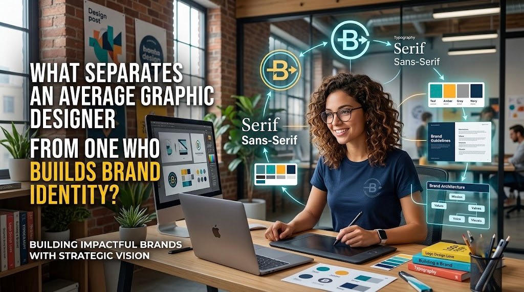
There is a distinction that separates a visually pleasing deliverable from a commercially meaningful brand, and most businesses only discover it after they have already paid for the wrong thing.
A graphic designer who produces an attractive logo, a set of social media templates, and a colour palette has completed a series of individual tasks. A brand identity designer has done something different: they have built a coherent system through which a business communicates who it is, what it stands for, and why it deserves a customer’s attention, across every surface where that customer might encounter it.
These are not the same service. Confusing them is one of the most common and costly mistakes businesses make when investing in design.
What a Brand Identity Actually Consists Of
A complete brand identity is not a logo. It is the total impression a business makes on anyone who encounters it, shaped by decisions that extend far beyond what a single graphic can carry.
The components that constitute a genuine brand identity include brand purpose and positioning, which defines what the business stands for and where it sits in its market. Target audience insight determines whose attention the brand is trying to earn and what those people actually respond to. Brand personality and tone of voice establish how the business communicates, whether authoritative or approachable, playful or precise. The visual system includes a primary logo and its variations, a colour palette with defined hierarchy for digital and print use, a typography system that structures communication clearly, visual style and image direction that governs photography and illustration choices, iconography and graphic assets that extend the visual language, and brand guidelines that document how every element is to be used.
Design decisions at each of these levels influence credibility, differentiation, emotional response, and recall in ways that a standalone logo cannot. A business whose visual identity is inconsistent across its website, its packaging, its presentations, its advertising, and its social media is communicating, unintentionally, that it has not decided what it is. Consistency across every touchpoint is not an aesthetic preference. It is a commercial asset that builds recognition, supports trust at every stage of the buyer journey, improves perceived value, and creates the foundation for scalable marketing communication.
| Brand Touchpoint | Identity Assets Required |
| Website | Logo, colour system, typography, image direction, graphic motifs |
| Social media | Branded templates, colour hierarchy, logo mark, tone of voice |
| Packaging | Full colour palette, logo variations, typography, brand patterns |
| Presentations | Template structure, typography hierarchy, colour system |
| Advertising | Visual style, image direction, logo clear space rules |
| Email signature | Secondary logo, colour, typography |
| Retail display | Brand patterns, colour, logo placement rules |
| Mobile advertising | Icon mark, condensed colour palette, legible typography |
Strategy Before Style: The Research Skills Great Brand Designers Bring
Skilled brand identity designers do not begin with colour palettes, font selections, or logo sketches. They begin with questions, because visual decisions that are not grounded in strategic understanding produce outputs that look designed but do not actually work for the business that commissioned them.
The discovery work that informs meaningful visual direction includes understanding the company’s mission, values, and commercial goals. Identifying the target audience’s needs, preferences, and buying triggers. Reviewing the competitive landscape and the visual conventions of the category to identify where differentiation is genuinely possible. Clarifying the brand’s desired market position and the emotional territory it wants to own.
Translating abstract brand qualities into visual decisions is where strategic and creative capability converge. A premium brand may require refined typography, a restrained palette, and considered spacing that communicates exclusivity without stating it. A youth-focused brand may use expressive illustration, energetic colour, and formats designed for social platform adaptability. A trust-led professional services brand may need clean structure, strong hierarchy, and the kind of visual confidence that communicates competence before a word is read.
The strategic questions a designer should ask during a client briefing include: Who is the brand trying to reach, and what do those people care about? What should someone think or feel after encountering this brand? What customer problem does the business solve, and is that reflected in its visual identity? Which competitors should the brand avoid resembling? Where will customers most often first encounter the business? And what future services, markets, or products might the business expand into, which the identity must be flexible enough to accommodate?
| Stage | Average Graphic Designer | Brand Identity Designer |
| Discovery | Brief review, asset collection | Strategic workshop, audience and competitor research |
| Strategy | Proceeds to design | Develops a positioning and visual direction framework |
| Concept development | Creates logo options based on preferences | Develops concepts grounded in brand strategy |
| Delivery | Provides logo files | Delivers a complete identity system with guidelines |
| Long-term use | Project concludes | Identity scales across touchpoints with documented rules |
A strong brand designer also protects businesses from design trends that do not align with long-term positioning. The instruction to make something feel “modern” or “make it pop” reflects aesthetic preference, not strategic direction. Research-backed decisions about what the identity needs to communicate and to whom produce work that remains relevant and effective beyond the current season of visual fashion.
Systems, Storytelling and Scalability: Designing for Every Brand Touchpoint
1. Build a Complete Brand System
A brand identity should be more than just a logo. It should include a primary logo, secondary logo, icon, colour palette, typography, patterns, imagery, and design templates. This allows the brand to look consistent across websites, social media, advertisements, packaging, and printed materials.
2. Design for Different Platforms and Sizes
A strong identity must work across different environments. A logo should be recognisable on both a large billboard and a small social media profile. Similarly, colours and typography should work across websites, mobile screens, presentations, and printed materials.
3. Connect Graphic and Digital Design
Graphic design applies visual communication principles across print and digital formats, while digital design focuses more on screens, interfaces, responsiveness, and user interaction. A good brand identity should be flexible enough to work effectively in both physical and digital environments.
4. Maintain Consistency Across Content
Consistent branding helps customers recognise and remember a business. Using the same colours, typography, imagery, layouts, and visual elements across social media and marketing materials creates a stronger connection between the content and the brand.
5. Prioritise Readability and Accessibility
Good branding should not only look attractive but also communicate clearly. Strong contrast, readable typography, proper white space, logical information hierarchy, and accessible design choices make content easier for a wider audience to understand and use.
Human Judgement in an AI Era: What Makes a Designer a Brand Builder
AI design tools have become genuinely useful contributors to the design process. They support rapid concept exploration, early-stage moodboard development, background removal, template production, content resizing, variation generation for testing, and faster iteration on routine tasks.
What AI cannot do is replace the strategic thinking that makes a brand identity commercially effective.
AI does not inherently understand a business’s market position. It reproduces visual patterns that exist in its training data, which means it tends toward the generic rather than the differentiated. It cannot independently resolve competing stakeholder priorities or determine which is most important for the brand’s long-term health. It produces inconsistent outputs without strong human direction. And it cannot substitute for human judgement about originality, relevance, and the long-term ownership of a visual identity in a specific market.
The traits that distinguish a brand-building designer from a production-focused one include curiosity about the business behind the brief, the ability to translate strategy into visual meaning, a strong understanding of audience psychology, the confidence to challenge feedback that would compromise the brand’s effectiveness, attention to detail across every brand application, the ability to design systems rather than isolated assets, commercial awareness and respect for marketing objectives, and the communication and collaboration skills to work effectively with stakeholders who are not designers.
When assessing a designer’s portfolio, the indicators of genuine brand identity capability are not the most polished mock-ups. They are strategic case studies that explain the thinking behind the work, consistency across multiple applications, visual distinctiveness within the category, before-and-after examples where available, and evidence that the work connected to a measurable business objective.
Before appointing a designer, businesses should ask: What discovery process will shape the project? Which brand assets will be delivered? Will a brand guideline document be included? How will the identity perform across digital channels? How will feedback and revisions be managed? Can the identity scale as the business grows?
These questions separate a design project that produces assets from one that builds a brand.
Build a recognisable identity that supports real marketing outcomes with Opus Momentum, a performance marketing agency in India that combines brand strategy with commercial thinking to create identities built to work as hard as the businesses behind them.
Sources: