
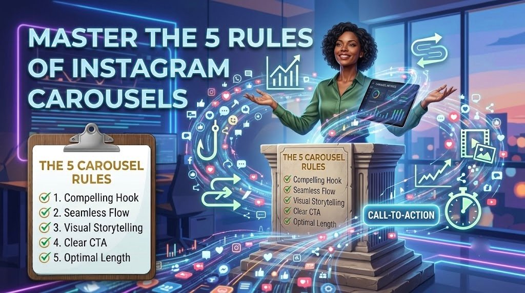
Brands post carousels regularly, yet most get abandoned after the very first slide. This isn’t usually a failure of effort. It’s a failure of strategy.
A strong Instagram carousel engagement strategy doesn’t rely on guesswork or posting frequency. It relies on a handful of consistent rules that determine whether a carousel gets swiped through or scrolled past.
Drop-Off Rate by Slide Number
| Slide | Typical Audience Remaining |
| Slide 1 | 100% |
| Slide 3 | 65% |
| Slide 5 | 45% |
| Slide 7 | 30% |
| Slide 10 | 18% |
This article breaks down the five rules separating carousels that hold attention from the ones that lose it early.
Rule One: The First Three Seconds Decide Everything
A strong hook slide typically relies on a few core mechanics. Bold text hierarchy pulls the eye to the most important word first. Curiosity gaps leave a question unanswered on purpose, giving the viewer a reason to swipe. Pattern interrupts break the visual rhythm of a feed, catching attention before the thumb keeps scrolling.
Common hook slide mistakes tend to repeat across brands. Vague titles that explain rather than intrigue. Cluttered visuals that compete with the headline instead of supporting it. Openings that summarise the whole point upfront, leaving no reason to continue.
A weak hook slide often reads like a caption. A strong one reads like the first line of a story someone actually wants to finish.
Rule Two: Design That Guides the Eye, Not Just Decorates the Slide
Once a hook earns the first swipe, design determines whether the second one follows. A few core design principles hold most high-performing carousels together. Consistent colour palettes keep the sequence visually unified from slide to slide. Readable typography avoids forcing viewers to squint or slow down. Clear visual hierarchy makes it obvious what to look at first, second, and third. Generous spacing keeps each slide easy to scan in the second or two most viewers give it.
Design continuity between slides does more than look polished. It subtly signals that there’s more value ahead, which is often what keeps a thumb moving instead of stopping.
Design Checklist
| Element | What to Check |
| Typography | Legible at a glance, consistent sizing |
| Colour consistency | Same palette used across all slides |
| Whitespace | Enough breathing room around text |
| Slide-to-slide continuity | Visual thread connecting the sequence |
Opus Momentum helps brands design carousels with intention rather than relying on generic templates. For businesses researching a social media agency in Bhopal that understands both strategy and visual execution, this is often the gap between content that gets ignored and content that gets remembered.
Rule Three: Structure the Story So Every Slide Earns the Next Swipe
Design keeps a viewer interested. Structure is what actually keeps them moving. A few storytelling habits show up consistently in carousels that perform well. Building a clear beginning, middle, and end gives the sequence a reason to exist beyond just listing points. Using small cliffhangers between slides keeps momentum going, since each one leaves something unresolved. Ensuring every slide answers a question while raising a new one creates a loop that only closes at the final slide.
There’s a meaningful difference between a carousel that reads like a list and one that reads like a story. A list can be skimmed and abandoned at any point without losing much. A story creates a sense of incompletion until it’s finished, which is exactly why story-structured carousels tend to hold attention longer.
Rule Four: Measuring What Actually Signals Success
Once a carousel is live, the right metric determines whether it actually worked. The swipe-through rate shows what percentage of viewers who saw the first slide continued to the next ones. A healthy swipe-through rate typically stays well above the drop-off most carousels experience by slide three or four. This number reflects genuine audience interest slide by slide, rather than surface-level exposure.
Likes and reach can look strong even when a carousel performs poorly past the first slide. Swipe-through rate cuts through that noise since it’s tied directly to whether the content held attention rather than simply appeared in a feed.
Carousel Performance Benchmarks
| Industry | Typical Swipe-Through Rate |
| Retail / E-commerce | 25% to 35% |
| Education / Coaching | 30% to 45% |
| B2B / Professional Services | 20% to 30% |
| Lifestyle / Entertainment | 35% to 50% |
Rule Five: Knowing When a Carousel Beats a Single Image
Carousels aren’t always the right format, and knowing when to skip one is part of using the format well. The algorithm tends to reward multi-slide content with extended engagement, since each swipe counts as an additional interaction. But single images still perform better in specific situations, particularly for quick announcements or moments that rely on one strong visual rather than a sequence.
A simple framework can guide this decision before content gets built. Consider the complexity of the message, since layered ideas suit carousels better than single slides. Consider the educational value, since step-by-step content naturally benefits from multiple slides. Consider the desired engagement type, since carousels invite swipes while single images often invite quicker likes or shares.
| Factor | Carousel | Single Image |
| Reach potential | Higher with strong swipe-through | Faster initial reach |
| Engagement depth | Deeper, multi-step interaction | Quick, surface-level interaction |
| Ideal use case | Education, storytelling, tips | Announcements, bold visuals |
Conclusion
Mastering these five rules turns carousels from routine content into a genuine growth lever. A hook that earns attention, design that guides the eye, structure that tells a real story, metrics that reflect true engagement, and the judgement to know when another format works better – together these turn a carousel from another post competing for a fraction of a second’s attention into content that people actually stay for.