
Truly Organik — an identity system built to sit well on a shelf.
A full brand identity and packaging system for a new organic wellness brand entering a visually crowded category.
Truly Organik came to us with a product line ready to launch and no brand built around it. The goal was not just a logo — it was a complete visual system that would work across pill bottles, powder jars, and capsules, while also holding up on a billboard, a business card, and a product photo.
A product ready to launch, and no brand built around it.
- A product line — Moringa Pills, Moringa Powder, Moringa Capsules — ready to manufacture
- A working brand name, "Truly Organik"
- Certifications in place: ISO, FSSAI, GMP, Kosher
- Distribution partners waiting on shelf-ready packaging
- A logo system that worked small (a bottle cap) and large (a billboard)
- Packaging design for three distinct product formats, with a consistent visual identity across all
- A color system flexible enough for product variants but recognisable across the range
- Everything production-ready, with specifications that would hold up in print
The category — organic wellness supplements — is visually crowded. Most brands lean on the same tired cues: green leaves, earthy tones, generic serif fonts. Our job was to help Truly Organik feel credible inside that category without looking like every other bottle on the shelf.
Three products. One visual family.
Each product in the range needed to work on its own — but also to read as part of the same shelf. We built the packaging system around a consistent anatomy: a curved top cartouche holding the logo, a clear product name, an ingredient badge, three benefit icons, and a strong base band identifying the format.
Bottle · Pills
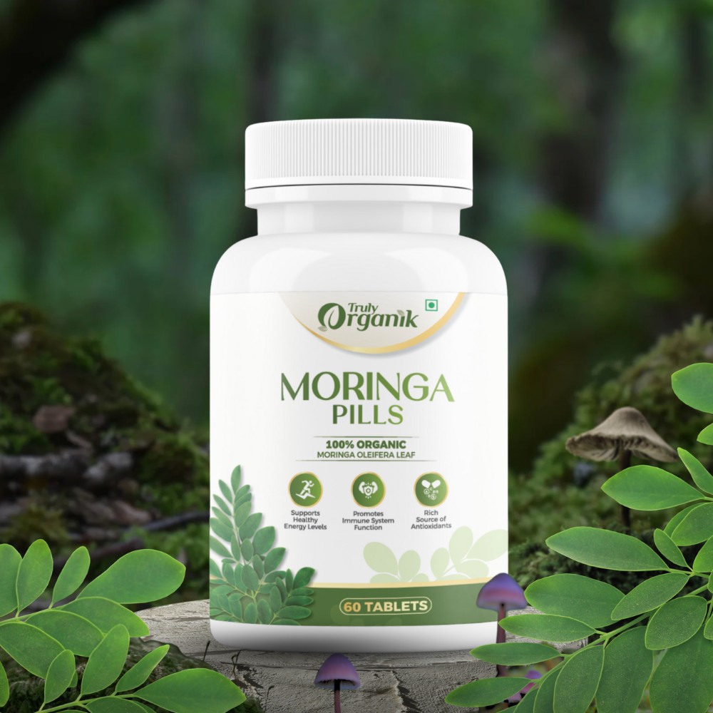
Moringa Pills
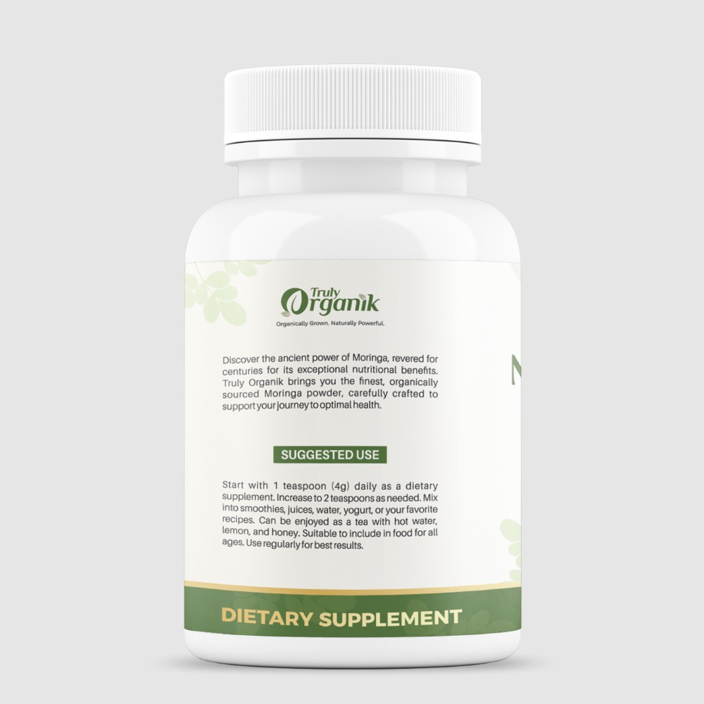
The anchor SKU. White bottle, green-and-cream label, gold detail lines. The front carries the brand mark, product name, benefit icons, and a clear "60 Tablets" count band at the base. The back holds ingredient details, storage, certifications, and manufacturer information — all laid out for legibility under retail lighting.
- 100% Organic · Moringa Oleifera Leaf
- 60 tablets · 450mg each
- ISO · FSSAI · GMP · Kosher certified
Jar · Powder
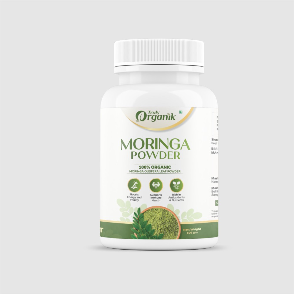
Moringa Powder
The powder variant uses the same label architecture, but introduces a circular product visualisation — a warm terracotta bowl of ground moringa nestled among leaves — that makes the format instantly recognisable on shelf. The "Nett Weight 100gm" detail sits where the tablet count sits on the bottle version, keeping the label geometry consistent across the range.
- 100% Organic · Moringa Oleifera Leaf Powder
- 100g net weight
- Three benefit icons: energy, immunity, antioxidants
Amber jar · Capsules
Moringa Capsules
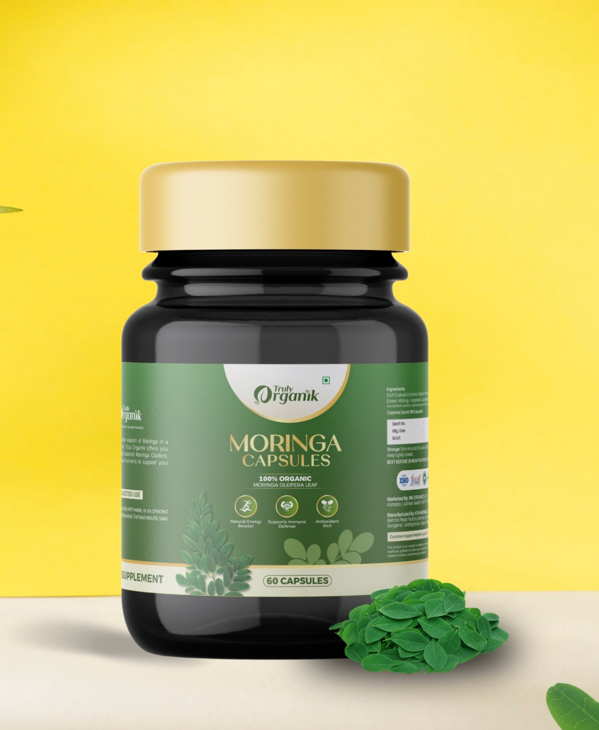
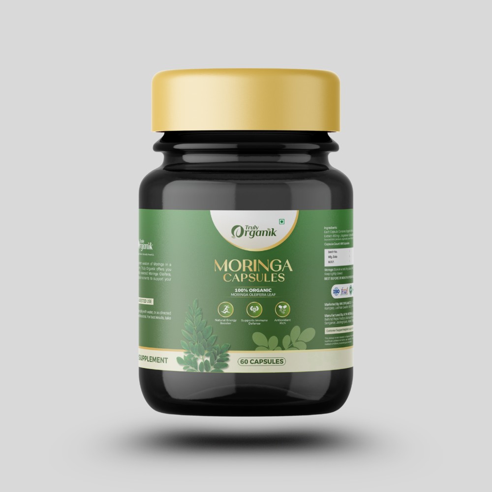
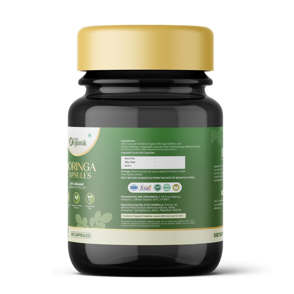
The capsule variant goes darker — amber glass, gold cap, green label — signalling a more premium tier within the same family. The label flips the colour relationship: dark green ground instead of cream, cream lettering instead of dark. Same anatomy. Different register. Designed to sit on a premium-wellness shelf without looking out of place next to its lighter siblings.
- 100% Organic · Moringa Oleifera Leaf Extract
- 60 capsules · 450mg extract
- Vegetarian capsule shell · premium tier styling
Six colours. One flexible system.
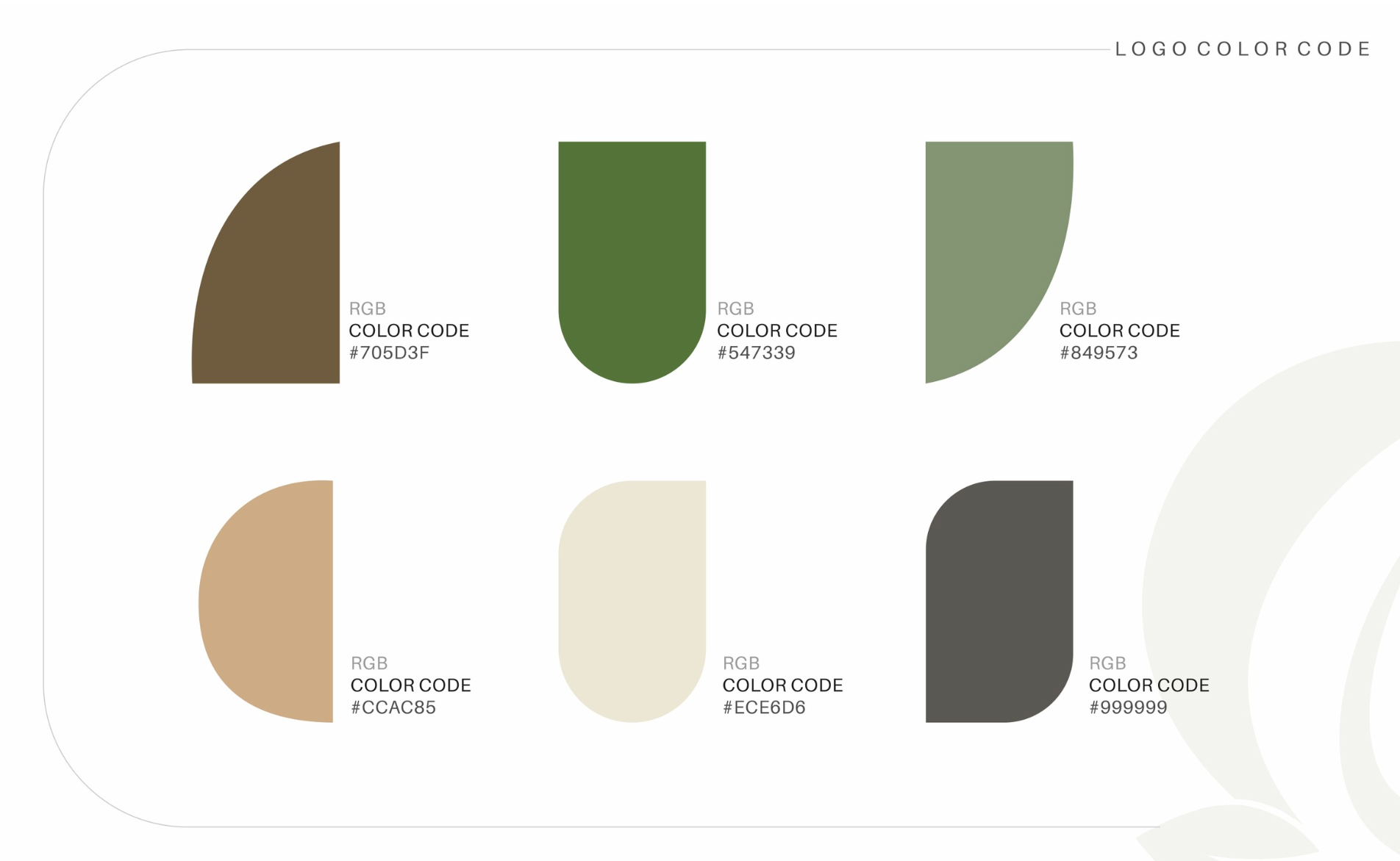
The palette is built around two primary greens — one confident, one softer — anchored by a warm brown and supported by tan, cream, and slate. Cream is the canvas; green is the identity; brown grounds it. Tan and slate handle secondary moments. Every product label pulls from this set, and so does every digital touchpoint.
Primary Green
#547339
The identity colour
Soft Green
#849573
Secondary applications
Warm Brown
#705D3F
Grounding tone
Tan
#CCAC85
Accent detail
Cream
#ECE6D6
Canvas
Slate
#999999
Utility grey
A complete system, ready to ship.
Need brand work that can actually ship on products?
If you are building a product-first brand and need identity and packaging that hold up in the real world — on shelves, on bottles, on billboards — we would be glad to help.
Career Weaver
Brand identity, a custom WordPress site and an Ivy League readiness quiz for a commission-free admissions consultancy.
Read the case study IdentityArcheluxe
An identity with the weight of architecture, for a premium HPL and architectural-panel distributor in Gwalior.
Read the case study SEOPage 3 to Page 1 in six months
An AI job aggregator up against Naukri, Indeed and LinkedIn, on a stack Google could not read. Six months later it ranked on page 1.