
Archeluxe — an identity with the weight of architecture.
A brand identity system for a high-pressure compact laminate and architectural surfaces distributor serving the Gwalior region.
Archeluxe is a premium stockist of HPL and APL surface materials — the kind of product that sits inside serious architectural projects. The brand needed an identity that looked at home in an architect's folder, carried weight in meetings with builders, and held its own on a building's signage. We built a mark around that exact brief.
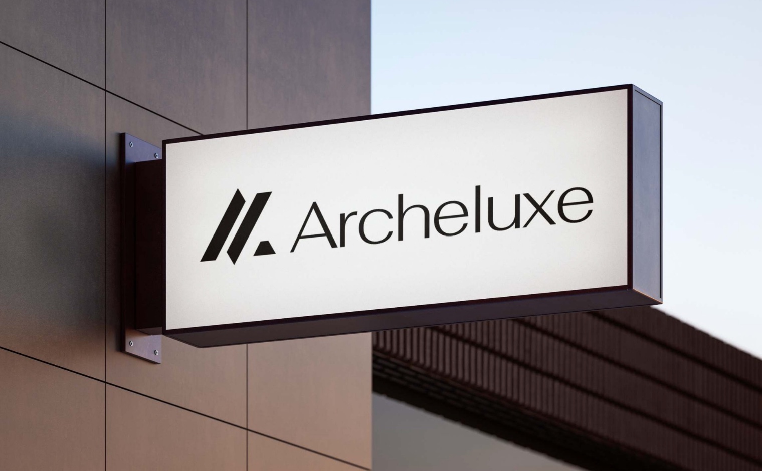
A premium materials business that needed to look the part.
- Stockist of HPL (high-pressure laminates) and APL (architectural panels) in the Gwalior region
- Selling into architects, interior designers, builders, and commercial project teams
- Competing in a category where brand perception directly affects specification decisions
- No existing visual identity beyond a working name
- Signal architecture, craft, and permanence — not generic home-goods retail
- Hold up at scale — outdoor signage, vehicle livery, project signage on construction sites
- Work in a single colour — for embossing, foil stamps, and material swatches
- Feel current, not heritage-borrowed — modern architecture, not 1920s luxury
The brand name itself carries the tension we worked with: "Arche" from arch, architecture, foundation — and "luxe", the promise of premium quality. The identity had to honour both halves of that name. Architectural rigour. Luxurious finish.
Two directions. Two different ways to say "architecture."
The name Archeluxe opens two doors. One leans into the bold geometry of modern architecture — rising forms, tension, motion. The other leans into the classical language of arches, windows, and doorways. We developed both routes in full before the client made the call.
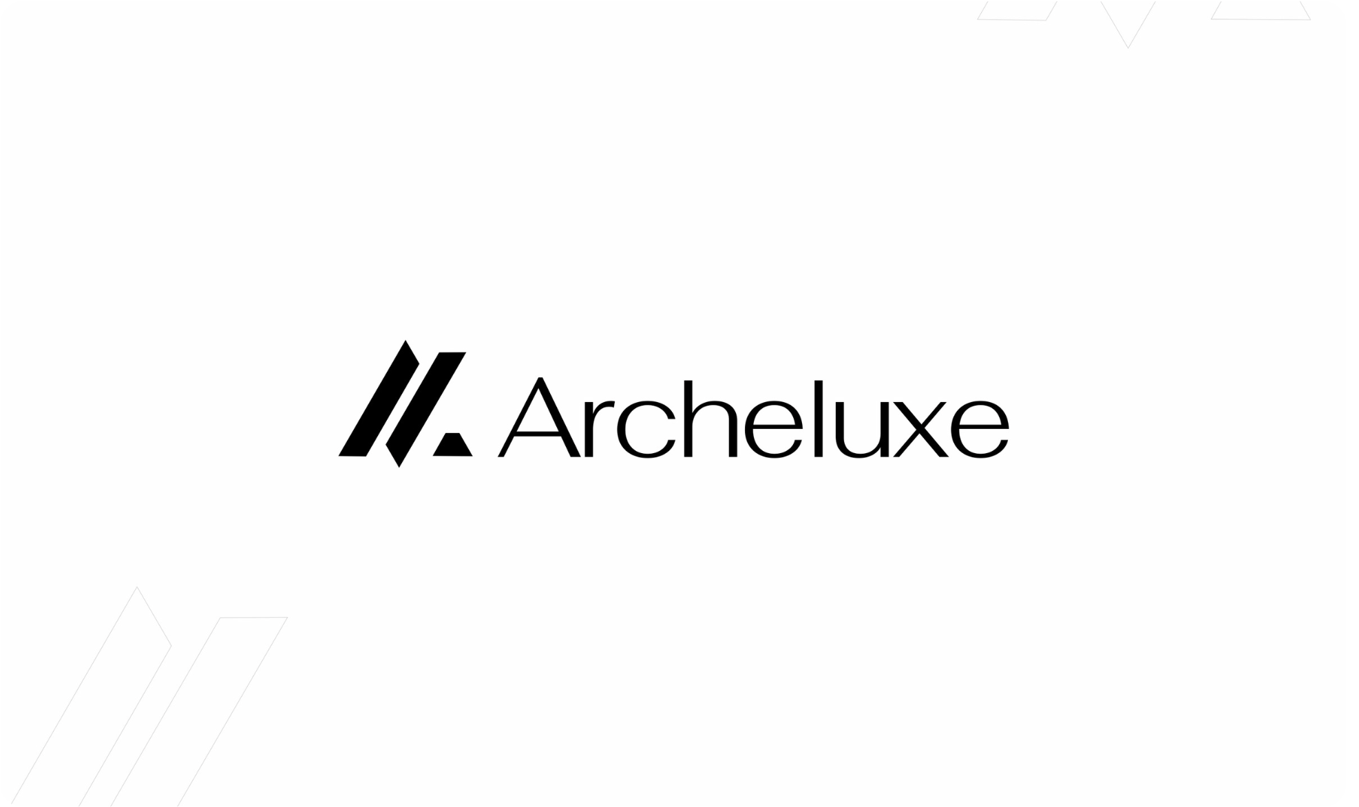
Rising geometry — the chevron mark
A stylised A built from two rising parallelograms with a single gold apex — reading as both the letter A and an upward architectural gesture. Clean, modern, confident. The kind of mark you'd expect on a contemporary museum or a Milanese design studio.
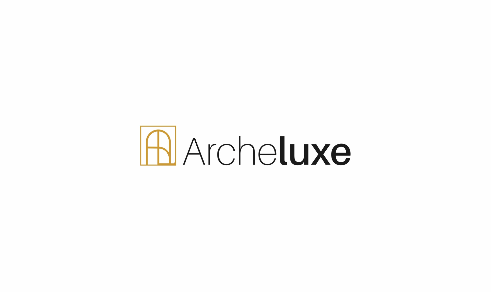
Classical arch — the window mark
A monogrammed "A" shaped as an architectural arched window, framed in a rectangle. More literal, more ornamental — referencing the Palladian and neoclassical vocabulary that still runs through high-end residential architecture. Elegant, but softer and more heritage-leaning than the chosen direction.

The client chose Direction 01 — and it was the right call. HPL and APL materials are fundamentally modern products, engineered surfaces for contemporary architecture. The chevron mark sits in that world. The arched window mark, beautiful as it is, would have pulled the brand toward heritage furniture or boutique hospitality — a different category entirely.
One mark. Built for every surface.
The selected logo was developed into a full lockup with prescribed treatments for every background, finish, and material. Gold for hero moments. Monochrome for functional applications. Foil or emboss-ready vector paths for premium print. The system is designed to stay recognisable whether it's printed small on a material swatch or fabricated three-dimensionally on a showroom wall.
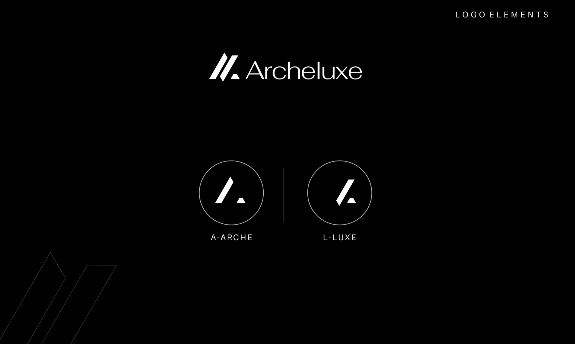
Primary · Gold on white
For stationery, brochures, and light-background print.
Reverse · White on black
For dark backgrounds, video thumbnails, and low-ink signage.
Mono · Black on white
For fax, newspaper, single-colour tech-pack reproduction.
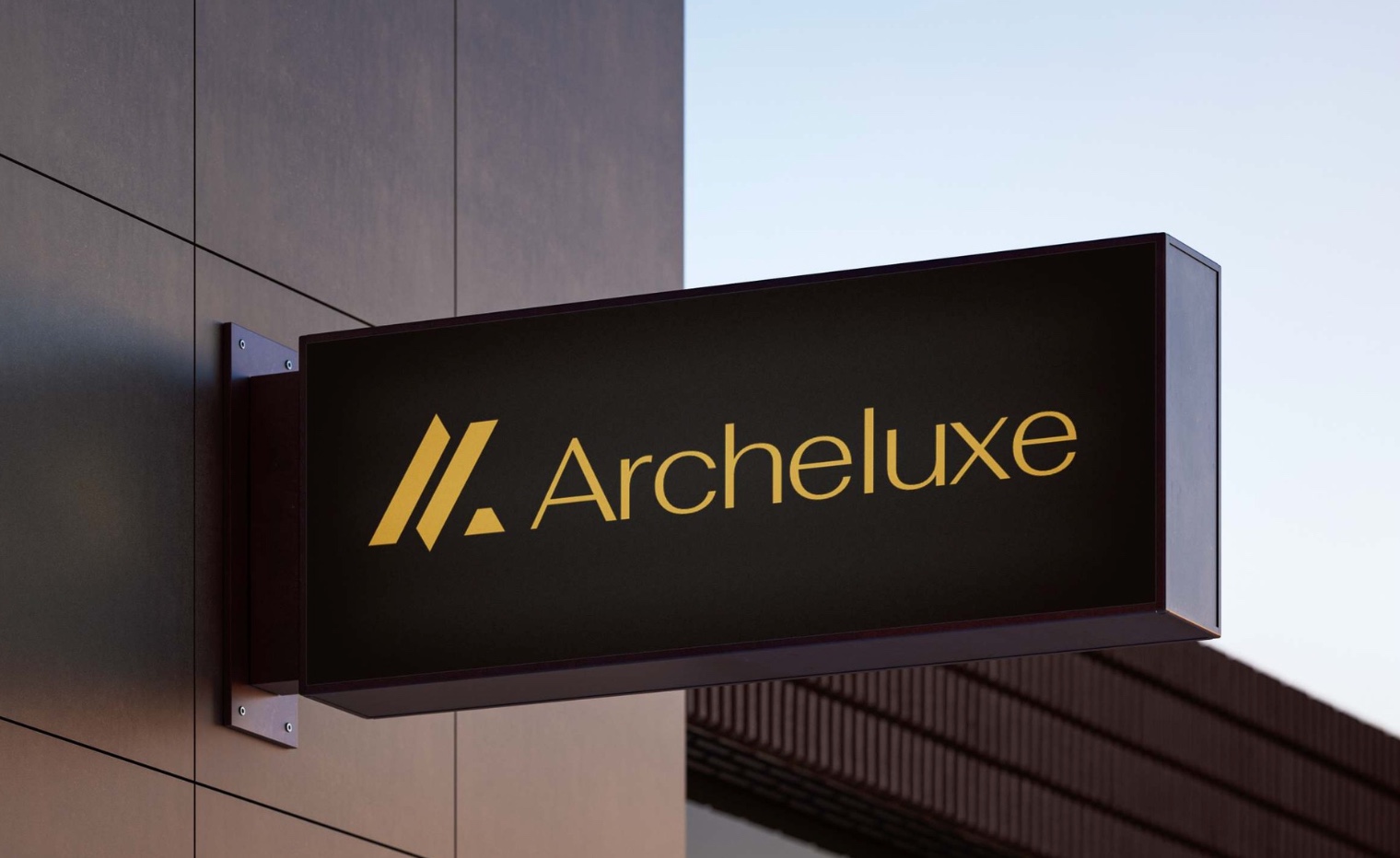
Fabrication preview
The mark was designed with physical fabrication in mind — brushed metal, polished brass, gold-leaf on stone, or CNC-routed acrylic all work within the geometry.
Career Weaver
Brand identity, a custom WordPress site and an Ivy League readiness quiz for a commission-free admissions consultancy.
Read the case study Identity · PackagingTruly Organik
A brand and packaging system for an organic wellness range across pills, powder and capsules.
Read the case study SEOPage 3 to Page 1 in six months
An AI job aggregator up against Naukri, Indeed and LinkedIn, on a stack Google could not read. Six months later it ranked on page 1.