
Career Weaver — an identity that belongs in the schools it sends students to.
A full brand identity and a custom WordPress website with an interactive readiness quiz, built for a commission-free Ivy League admissions consultancy.
Career Weaver is a Faridabad-based counselling practice founded by industry veterans who came from the Princeton Review and Jamboree with a clear conviction — that students applying to Harvard, Oxford, or Cambridge deserve mentors, not salespeople. Our job was to build a brand and a digital home that visually earned that same level of seriousness.
A 26-year admissions practice that needed to look as serious as its promise.
- Founded by Ashwani Kaushik (26+ yrs, ex-Princeton Review & Jamboree) and co-founders Inderjeet Singh and Ritesh Desai
- Operating in a category dominated by high-pressure agents taking university commissions
- Targeting families applying to Harvard, Oxford, Cambridge, Yale, Stanford, Wharton, LBS, INSEAD
- Differentiator: zero commissions from universities, unlimited essay drafts, 11am–10pm availability 7 days a week
- Visually signal institutional credibility — look at home next to the logos of the universities on its own wall
- Feel premium and paternal, not transactional — mentor, not agent
- Translate into a digital experience calm enough for anxious parents and crisp enough for high-achieving students
- Include a lightweight engagement hook that converts curious visitors into conversations, without pressure tactics
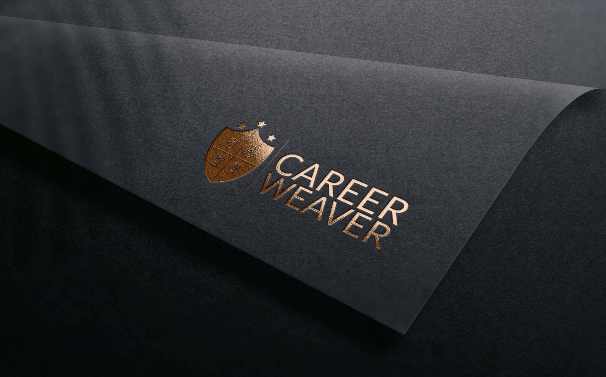
Career Weaver applies students to institutions with centuries of visual heritage — shields, seals, serifs. The brand identity had to borrow from that same language with fluency, not pastiche. An identity earned by association.
Two directions. Same name, two ways to wear it.
Career Weaver sends students into institutions built on crests, coats of arms, and centuries of typographic gravity. We tested two routes — one that leaned fully into that heraldic inheritance, and one that stripped it back for a more modern, confident register. Both used the same shield mark and symbolic language, but sat in very different emotional registers.
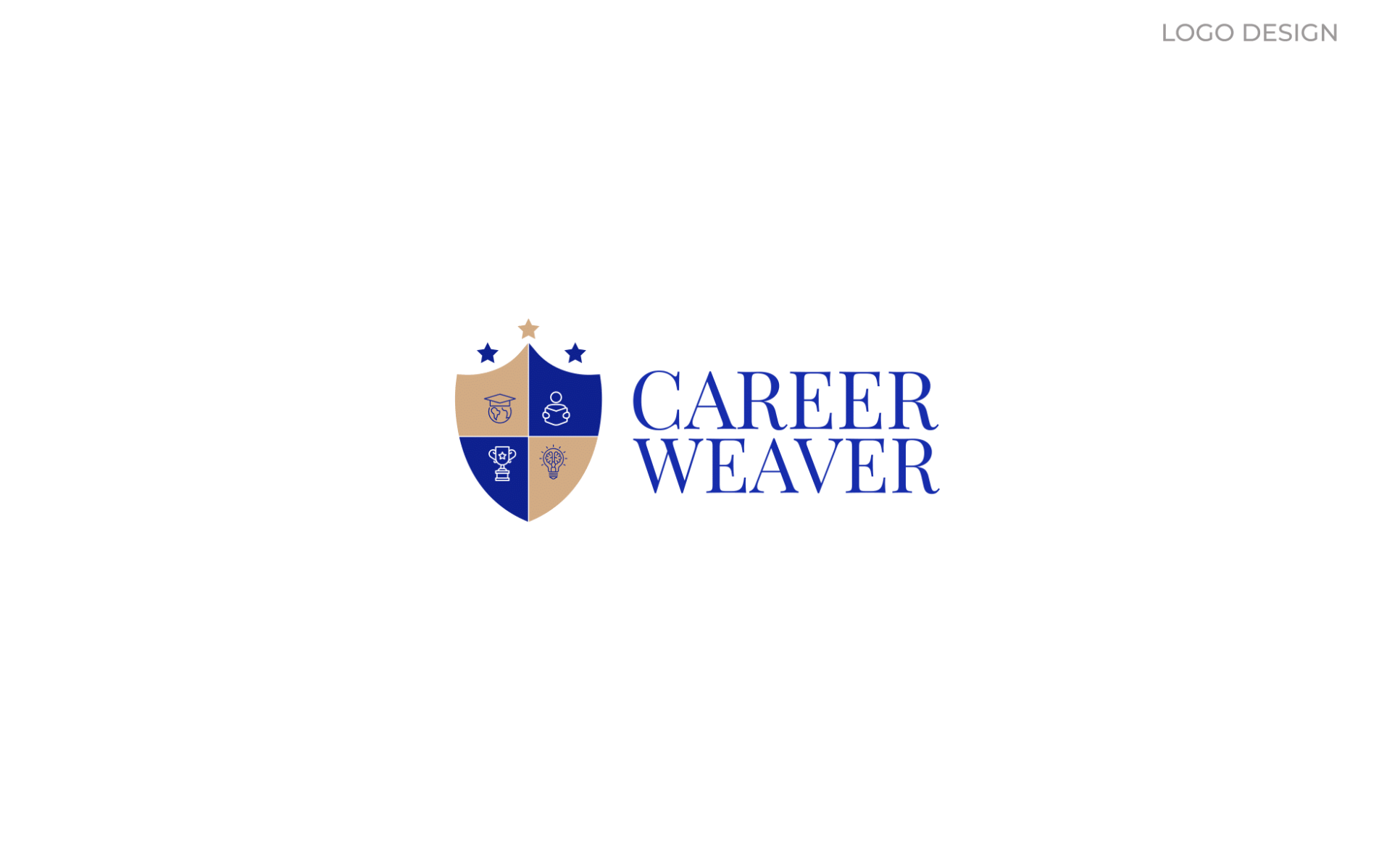
Heraldic — the serif lockup
A quartered shield in deep academic blue and warm tan, crowned with three stars — one golden, two navy. The wordmark sits in Playfair Display, a classical serif with the measured pace of a university seal. The result feels inherited, not invented — like something that could have existed for fifty years without anyone questioning it.
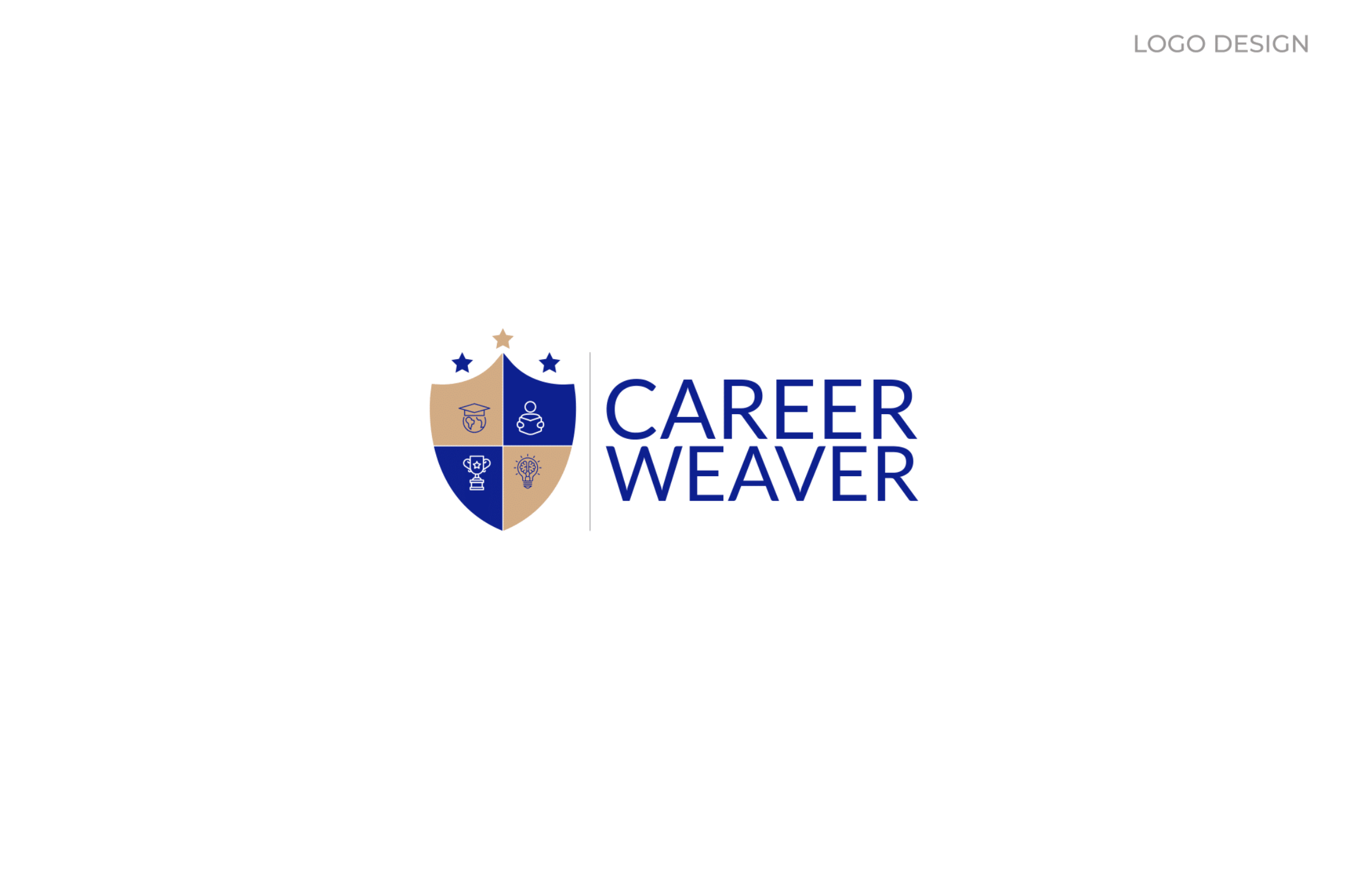
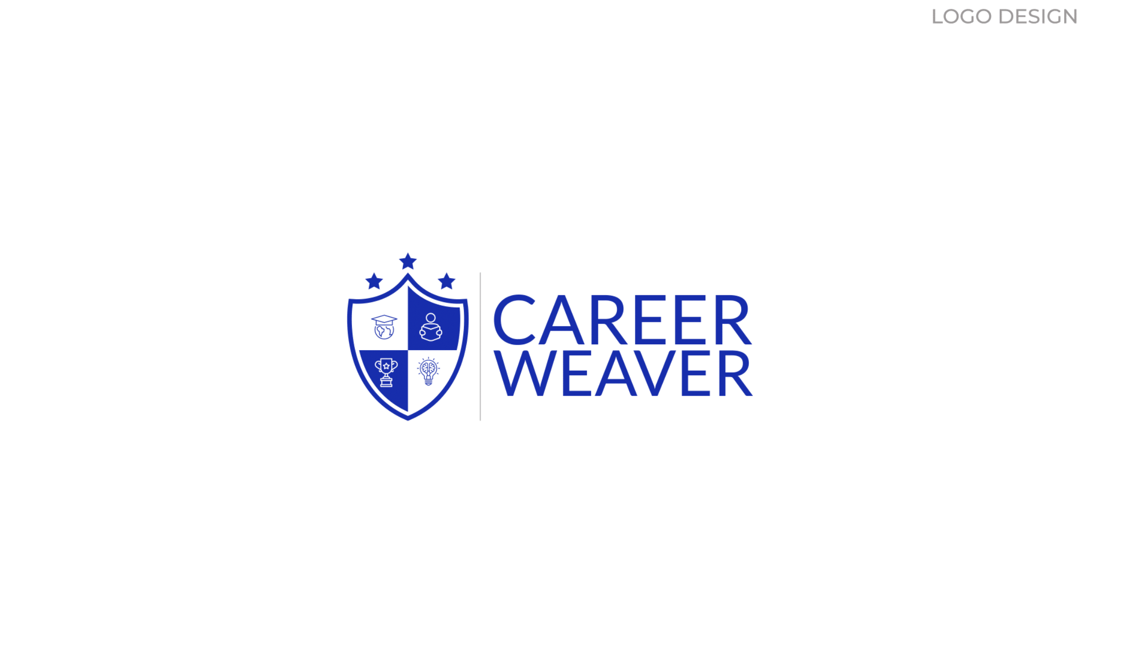
Modern — the geometric lockup
The same four symbolic quadrants — globe and cap, reading student, trophy, mind-and-bulb — reorganised inside a flat, geometric shield with sharper corners. Paired with a confident sans-serif wordmark. More tech-forward, less traditional. A good fit for a modern EdTech company — but ultimately too "product" and not quite "practice" for Career Weaver's positioning.
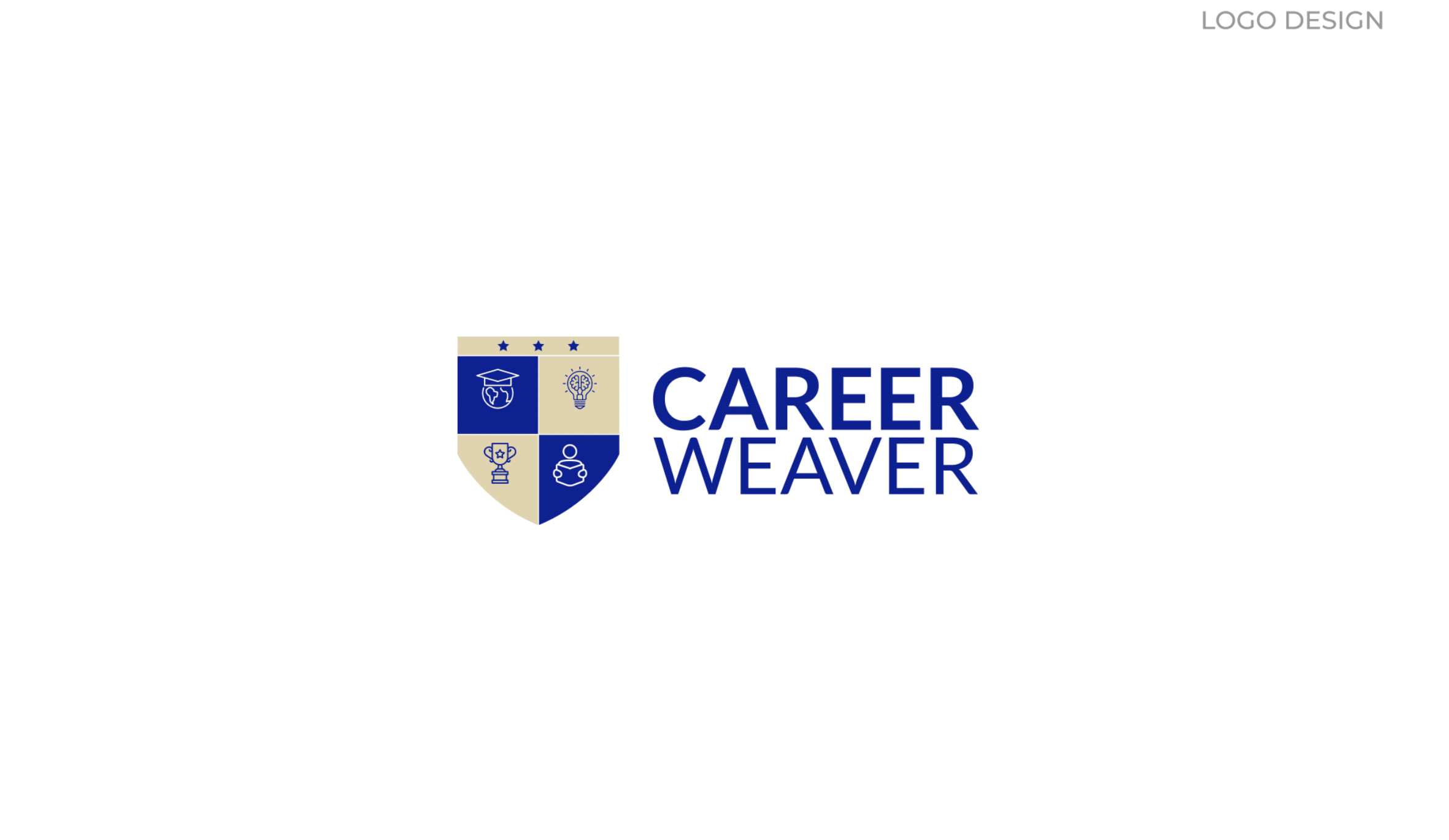
The client chose Direction 01. The serif-led lockup sits with the vocabulary of Harvard, Oxford, and Yale without borrowing their crests. It tells parents and students — before they read a single word of copy — that this is a practice, not a product.
Four quadrants. One argument for ambition.
A shield only works if every element inside it is doing a job. We designed each quadrant of the Career Weaver mark to carry a distinct idea — the four pillars the practice itself was built on. The three stars above — one gold, two navy — represent guidance, achievement, and the reach for higher goals. Together they form a compact argument for the kind of student this brand serves.
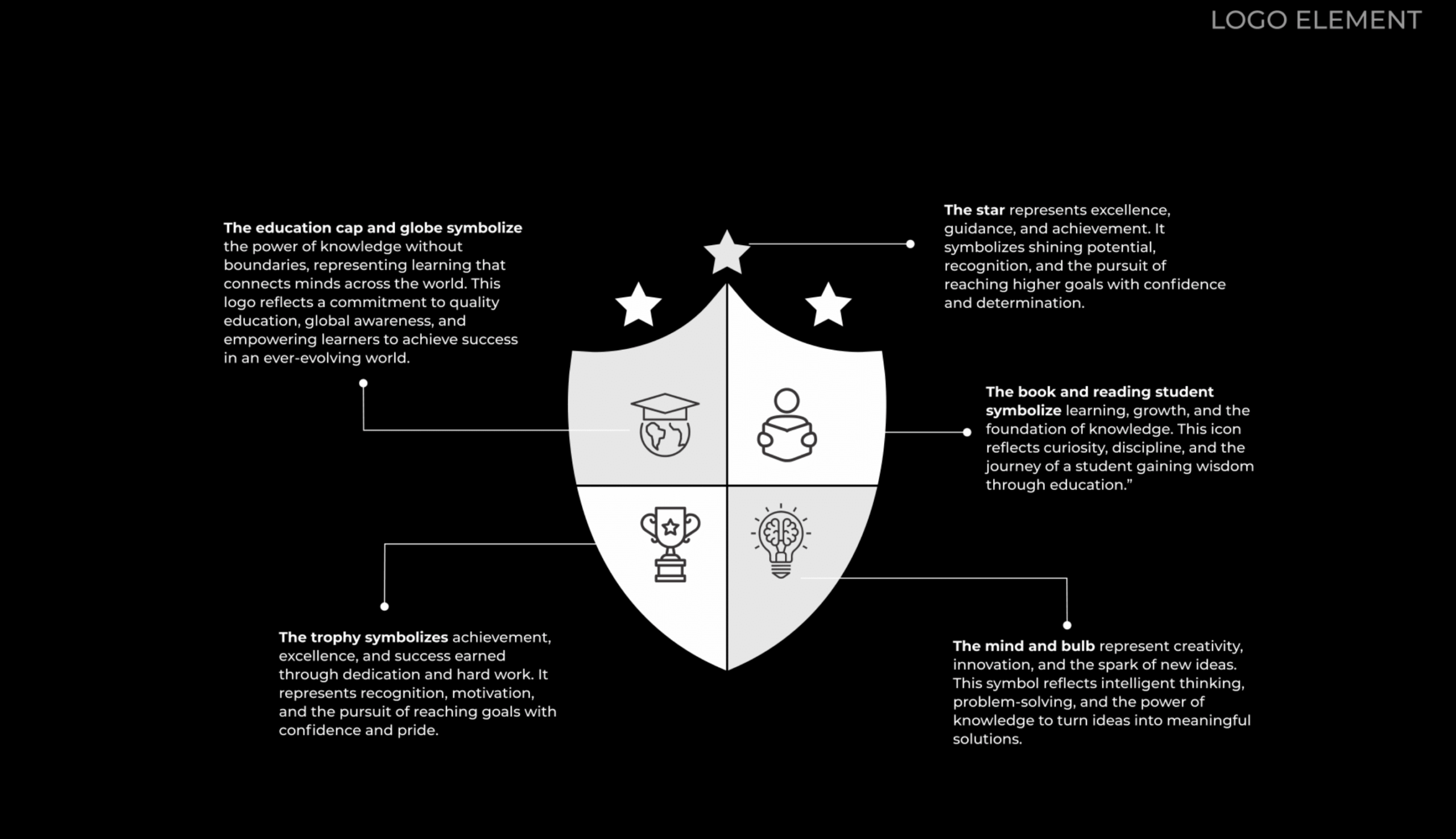
Cap & Globe
Knowledge without boundaries. Learning that connects students to opportunities beyond their home country.
Reading Student
Curiosity and discipline. The foundation every successful application is actually built on — long before the essay.
Trophy
Earned achievement. Not a promise of prestige — a signal of work done to deserve it.
Mind & Bulb
Original thinking. The one thing admissions committees really look for — and the one thing templates cannot fake.
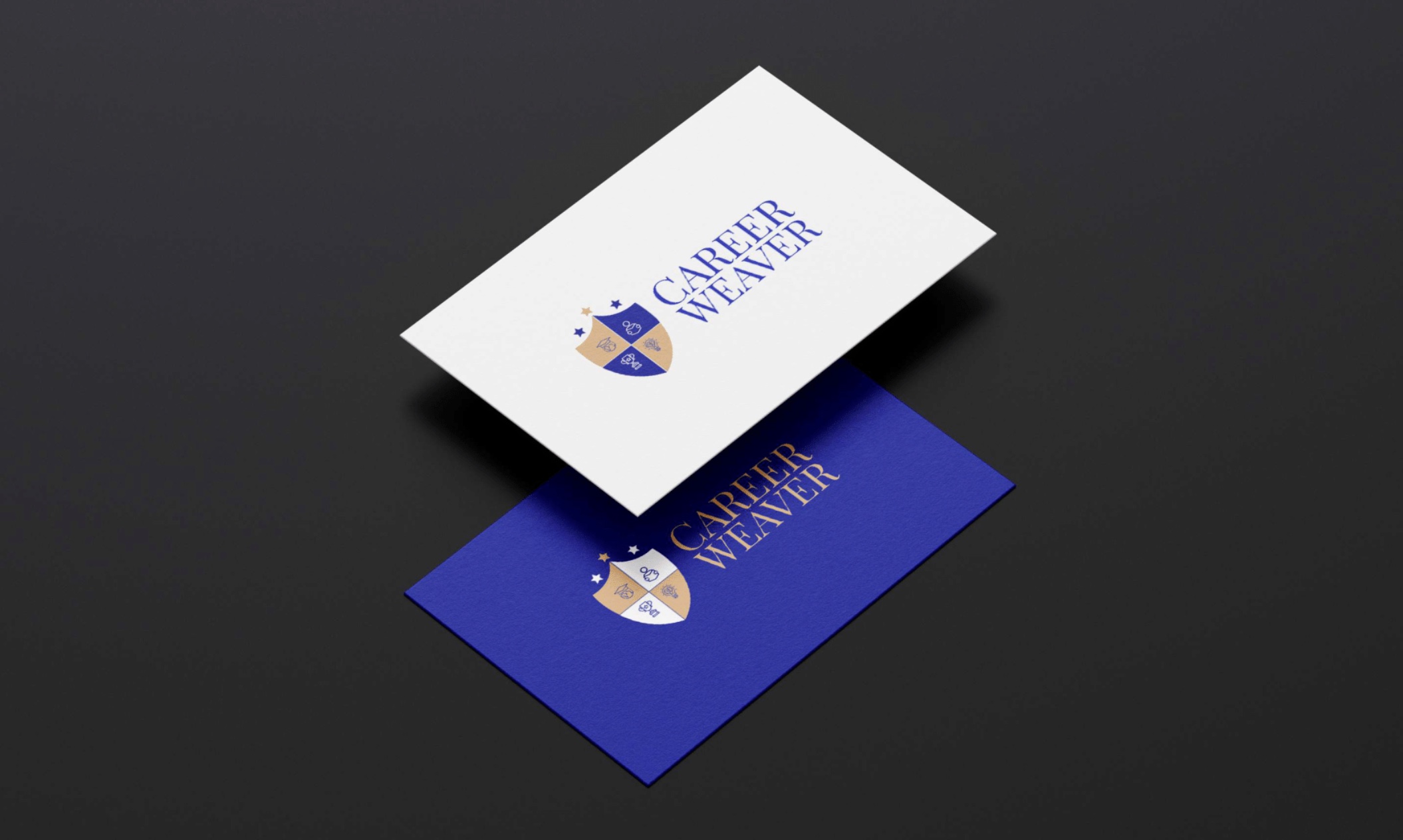
Business cards · gold foil treatment
The primary stationery system uses the heraldic lockup on cream card stock for everyday use, and a gold-foil-on-blue treatment reserved for founder cards and first-meeting moments.
Built to feel calm, not loud.
The full palette is four colours plus black — deep academic blue as the identity anchor, a brighter secondary blue for digital emphasis, warm tan and cream drawn from the shield itself. The type system pairs Playfair Display for headlines (for that serif gravity), Lato for body (for warm, readable paragraphs), and Montserrat as a functional sans for UI and short labels. Nothing fights. Everything earns its place.
Colour palette
Primary Blue
#18208F · PANTONE 6817 C
Identity anchor. Headlines, shield fill, primary UI.
Bright Blue
#172BAA · PANTONE 6717 C
Digital emphasis. Links, active states, the quiz.
Warm Tan
#D6AB82 · PANTONE 728 C
Warmth. Shield accent, the golden star, foil treatments.
Soft Cream
#E3D4AD · PANTONE 7501 C
Stationery background. Subtle section tints.
Ink Black
#373435
Body copy. Warmer than pure black, easier to read at length.
Typography
A website built on restraint — and one quiet interactive hook.
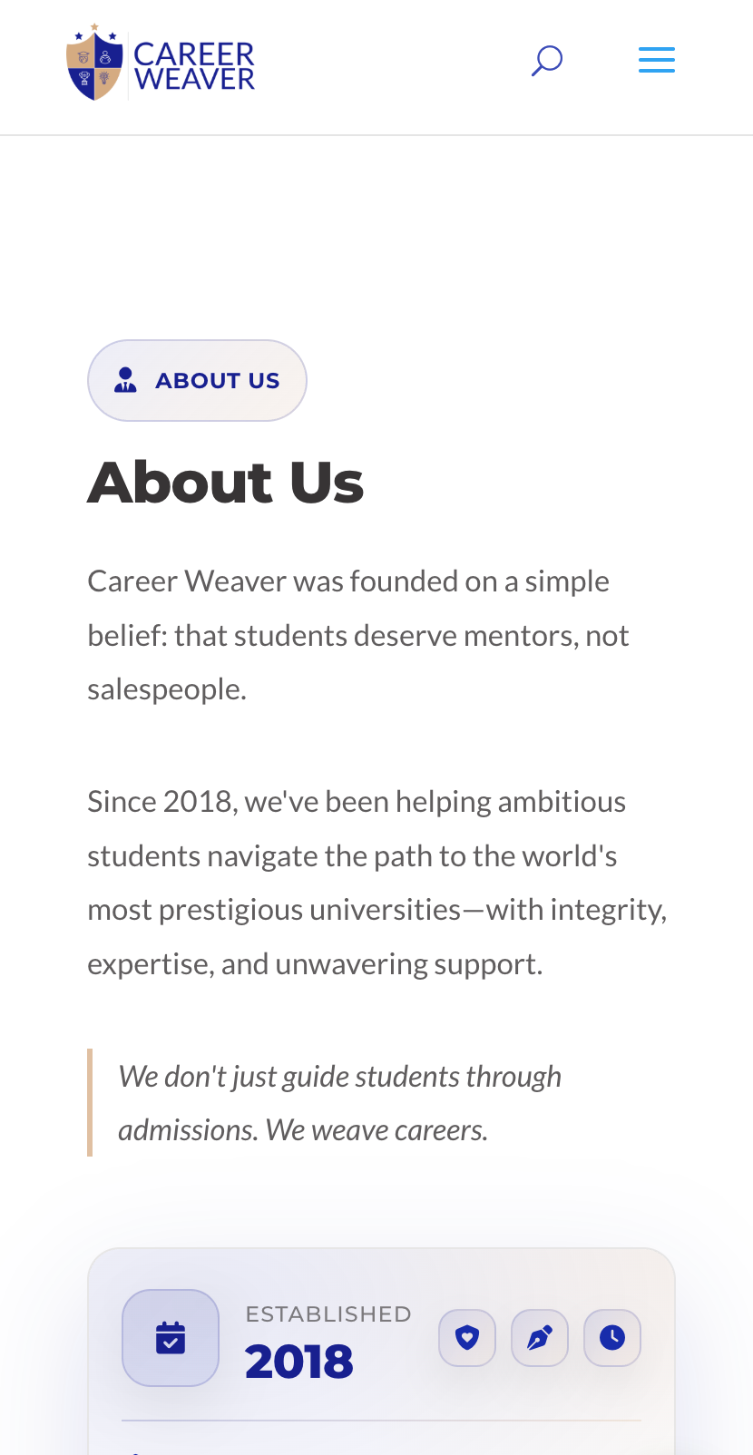
Most admissions consultancy websites scream: countdowns, testimonials on loop, aggressive form popups. Career Weaver's positioning demanded the opposite. We designed and built a custom WordPress site focused on calm typography, generous whitespace, and measured pacing — so the content itself could do the selling. The visitor should feel the same calm they'd feel walking into a good mentor's office. Not pressured. Not pitched to. Heard.
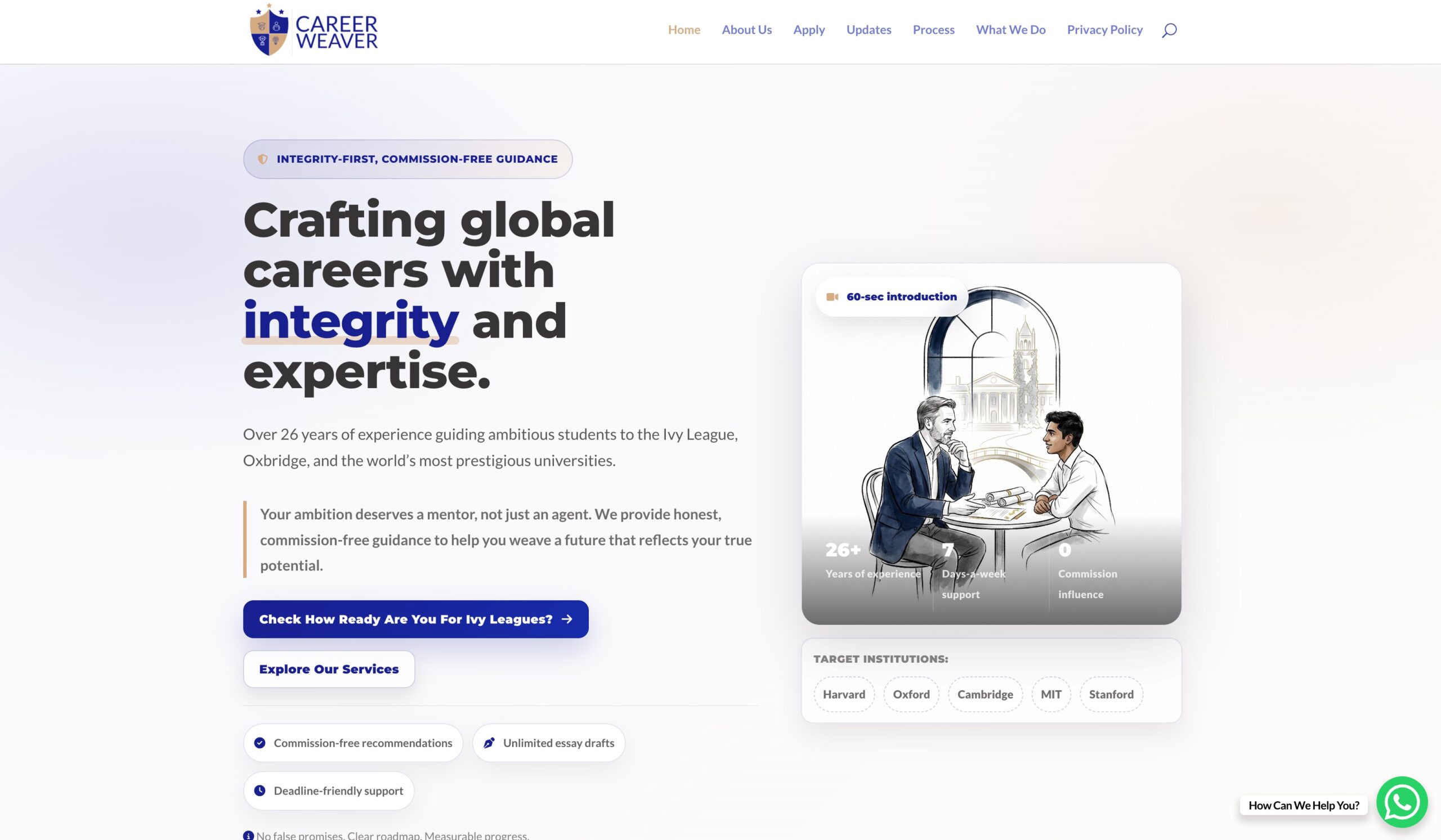
Designed on the desktop. Tuned for the phone.
Most of the real traffic here is parents reading about the practice on their phones at 10 PM after their child has gone to bed. The mobile layout isn't a shrunken desktop — it's a reconsidered experience. Simpler hierarchy, larger tap targets, clear pathways to either book a consultation or take the quiz without scrolling through marketing copy first.
- Custom WordPress theme, hand-coded HTML / CSS / vanilla JS — no bloated page builders
- Editorial typography — Playfair for H1s, Lato for body, tuned for sustained reading
- Zero popups. Zero aggressive banners. Zero dark patterns
- Fast page loads on average 4G — critical for mobile parent audience
A readiness quiz that opens conversations — not closes sales.
Instead of the usual "book a free consultation" CTA, we built a custom 10-question interactive assessment — Are You Ivy League Ready? — that lives at a dedicated URL and gives every visitor a personalised readiness score in about three minutes. No email gate. No login. Just a starting point for the conversation. For Career Weaver, it's a soft, low-pressure way to give real value to a visitor — and for the visitor, it answers the one question parents are actually asking when they land on the site.
A full brand and a live site, ready to work.
Need an identity that carries weight — and a site that actually works?
If you are building a practice, a consultancy, or a service where perception is as important as product, we would be glad to help. We work on brand design, website design, and everything in between — always with the same care we brought to Career Weaver.
Going viral for a Hindi news network
A social reinvention and website rebuild for a Bhopal Hindi news brand with authority on television and silence online.
Patient records for rural healthcare
A field-grade records portal for NGO mobile medical units, designed around intermittent connectivity. MERN on Google Cloud.
Archeluxe
An identity with the weight of architecture, for a premium HPL and architectural-panel distributor in Gwalior.
Read the case study